Colour Blinding Testing
Keep in mind that users with visual impairments may perceive colours differently. To ensure accessibility and aid future design decisions, I conducted tests to understand how the designs appear to individuals with various types of colour blindness.
The first example screen below illustrates Deuteranomaly, a condition characterised by reduced sensitivity to green. The second screen demonstrates Protanomaly, which involves diminished sensitivity to red.
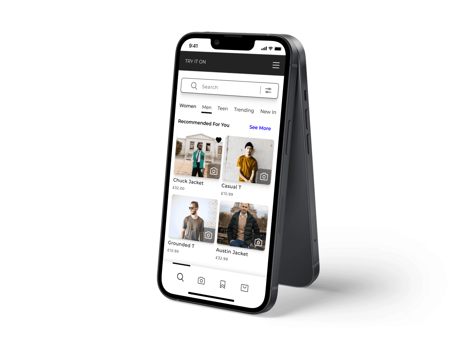
I enhanced my final concept designs by incorporating colour to showcase the potential appearance of the app. Additionally, I tested the colour choices to ensure they met at least WCAG AA compliance standards.
Colour Contrast Testing
Colour Contrast Testing
Accessibility
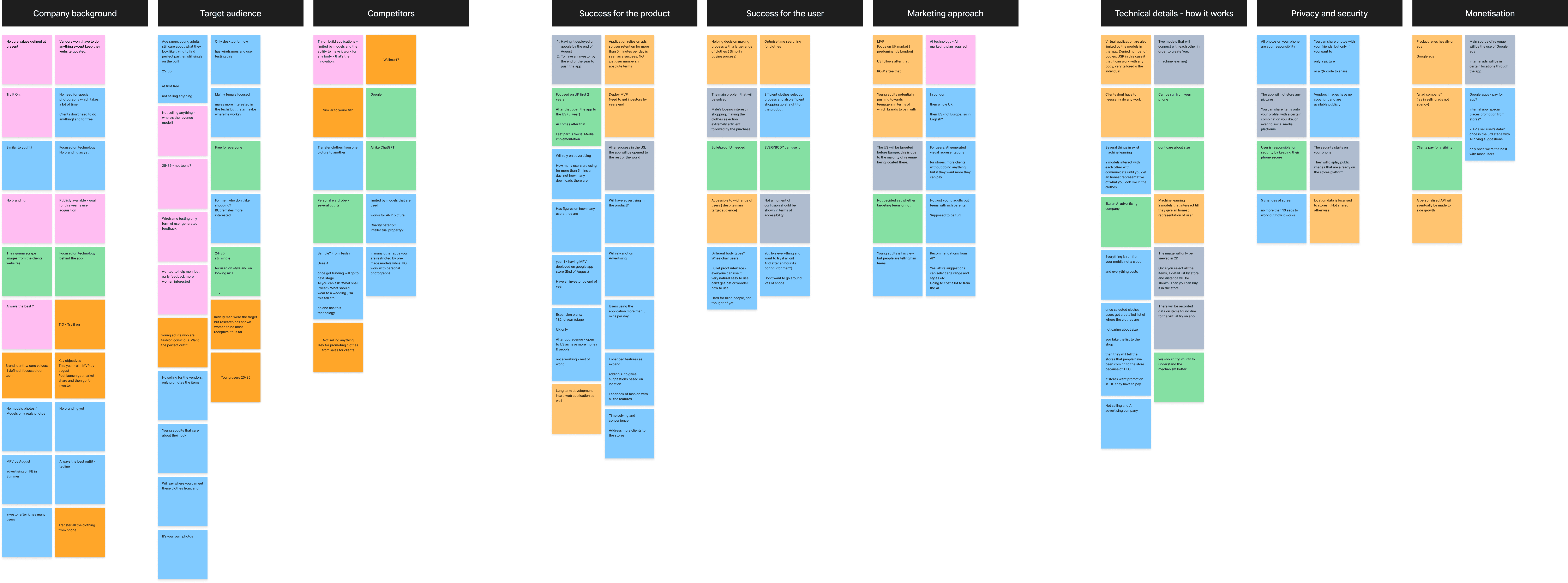
In smaller groups we were tasked with creating discussion guides which we would use to interview a number of users. The goal of these interviews was to gather insights into user opinions about the app, identify target audiences, and uncover pain points and needs.
Key Findings From User Interviews
Highlighted Concerns By Users/ Opportunities For Success
- Users stressed the need for personal measurements like height, waist, and bust to enhance the AI's accuracy in clothing fitting.
- They expressed concerns about the system's effectiveness without these details.
Measurements
The majority of users explained that they would prefer to receive emails rather then push notifications.
They feel that it is a more controllable method to receive information from the app and less intrusive.
Push Notifications
Uploaded photos aren't stored on the device.
Location data is only used for store localisation, not shared otherwise.
Photo - Angles
Shopping Habbits
Most users prefer shopping online for its convenience and accurate sizing guides.
Those using phones had no issues with site interfaces and usually shop for clothes every one to two months.
- 6 out of the 8 people I interviewed raised concerns about how their data would be stored.
Data Security
- 2 out of 8 raised a concern that using a flat 2d image to map clothes would not be a true representation of the product. Leading to a lack of confidence in the apps tech.
Representation Of Clothes
User Research Summary
TOTAL OF 25 GROUP
PARTICIPANTS
AGES 21-35
8 PARTICIPANT
CONTRIBUTIONS
4 MALE/ 4 FEMALE
MIXTURE OF BOTH
STUDENTS &
PROFESSIONALS
Utilise the ability to monetise purchase links.
Monestisation
Concerns about privacy and how the app uses personal data.
Security & Privacy
Opportunity to add the ability to input users measurements.
Customisation
Hopes the app is intuitive and has a glitch free try-on experience.
Experience
User wants a wide range of clothes, specifically from brands they like.
Personalised
Provide the ability to purchase products in app for a seamless
user experience.
Purchases
Key Findings From Experience Map
Experience Mapping
I created an Experience Map to step into the users' shoes, illustrating the potential paths they might take while using the app. This map highlighted key aspects such as what the user was thinking, feeling, their touch points and their actions. This deeper understanding of user interactions allowed us to refine and optimise the app development process for a more seamless and intuitive experience.
Stages
Awareness
Ben
Goal: Buy and try on clothes in a timely manner
Expectations: Quick and easy process
Discovery
Exploration
Using App
Decision Time
Awareness
Discovery
Using App
Decides what clothes to purchase and adds to wish list. Proceeds to process a shopping list.
Found the app online, checked reviews, and asked friends for clothing try-on app recommendations.
Downloads app from app store and installs on phone. Moves to creating an account on the app.
Completes the tutorial, explores app features and checks for favourite brands and other options.
Adds liked items to the try-on list, explores the A.I. try-on tech, uploads photos, tries outfits, and saves favourites.
Maybe this will save me time. I wonder what people are saying about the app and if my friends have any suggestions.
I hope they respect
my privacy and do not share my details. I hope they do not ask for loads of personal details!
Hopefully the app is intuitive and has m favourite brands! Maybe I should also test out clothes out of my comfort zone?
I’m curious about the app! Will the try on experience work? I hope it’s not glitchy. What do they do with my photos? I am not sure about this!
Is the price and fit right? Does it match my style? I really hope I don't have to return anything. Why can't this process be seamless?


Online, social media and review sites. Speaks to
friends.
Phone & app
App
App
App & Store
Maximise promotion and the amount of stores the app has available. Use feedback to improve. add refer a friend option.
Be upfront and transparent as possible on privacy and how data is used. Make the account sign up simple. Do not over complicate the process.
Add the ability to input measurements. Consider all country sizes. Keep steps to reach goal to a minimum. Make it easy for users to find brands fast.
Have a good A.I model that is free of glitches and provides a realistic image. Ask permissions to use camera. Make it easy to download looks!
Could monetise links that send users to 3rd party stores. Could add QR links, purchase links and item numbers. Be able to buy items in app.
Actions
Thinking
Feeling
Touch Points
Opportunities/
Solution
Based on insights gathered from user interviews, we each created multiple user personas to effectively represent the app's target audience. These personas, though fictional, are essential for keeping a user-centred approach, as they capture key details like users' goals, frustrations, needs, and motivations.
User Personas & User Stories


User
Story
Requirements
Needs

Lucy

Rachel


Ben
"I am always busy with work and I like the idea of a quick and streamlined app where I can try on and buy clothes."
An app that makes trying on clothes and buying them quick and simple with no complicated steps.
A user friendly interface that makes finding & trying on clothes quick & simple. A streamlined checkout.
"As a student that is about to leave University, I need an app that will help me find my first graduate role close by."
Recommendations of graduate roles in her area that meet Lucia's skillset and education level.
Create a clear and precise layout that highlights roles which match her skillset and education level.
"I don't have loads of clothes as I am in my work attire a lot. I want to get some new clothes to give me more confidence.”
Have a category that covers TV & Film with departments highlighted so he can find fast and easily.
Create a set of extensive filters that will help will dial into the niche sector that he is looking to enter.
Below are user stories for each of our personas, detailing their lifestyles, their specific needs from the try-on app, and the features required to fulfil those needs. Creating user stories was important as it kept the development focused on user needs, guiding design and feature decisions to ensure a better user experience.
Stakeholder Research Summary
Application
Offering diverse brand clothing for try-on, using AI to virtually model clothes on user pictures.
Operating solely as a try-on app, aiming for investor and Google app launch by August 2024.
T.I.O wanted initial research to be targeted at the 25-35 age range.
The app will be open to all genders but with a focus on female shoppers.
Initially UK-based, with plans for later expansion to the US.
Target Audience
Uploaded photos aren't stored on the device.
Location data is only used for store localisation, not shared otherwise.
Security & Privacy
Monestisation
The app will rely heavily on Google Ads for advertising.
Clients pay for visibility.
Api's will eventually aid growth.
Key findings from Stakeholder Interview
"I worked with Robert during the early stages of my startup. He demonstrated commitment, interest and exceptional skills in analysing and proposing UX/UI solutions considering the needs and challenges I had for my AI mobile app. I recommend Robert for his professionalism, skills and dedication."
Stakeholder - Try It On (London)
Competitor Analysis Insights
I conducted a detailed analysis of the competition identifying their strengths, weaknesses and USP's. This helped us to identify gaps in the market and opportunities for Try It On. Here are key insights from our initial findings:


Prada & Styleme allow shopping on the site for a seamless experience.
Zero 10 offers designer clothes.
Some offer realtime try-on experience.
Unique Selling Point
All competitors offer free access.
All competitors are on social media.
4 out of 5 allow you to add
measurements.
Advantages
Some use advertising.
Two competitors direct you to a
3rd party site to make purchases.
3 out of 5 were web based/
had no mobile app.
Disadvantages
Key findings from Competitor Analysis
Overview
Challenges
The company was in the early stages of its journey with minimal branding or market presence.
Although basic research was done, it was insufficient to clearly identify the target audience.
There was a lack of sufficient evidence to demonstrate the app's alignment with user needs.
Try It On is a London-based startup aiming to lead the virtual try-on market with a user-friendly app that offers lifelike 2D representations from user photos, accurate attire suggestions and a wide range of
clothing options from various stores to virtually try on.
I interviewed the stakeholder and users to identify pain points and needs.
Performed competitor analysis to evaluate market trends, identify gaps, and inform strategic decisions.
Leveraged data analysis techniques, including personas, experience mapping and affinity mapping, to drive informed decision-making and streamline processes.
Created sketches, wireframes & prototyped app screen concepts followed by basic user testing.
Try It On
Mobile App
Direct Contributions
UX Research/ Wireframing/ Prototyping/ Usability Testing
Team Size: 10
Mobile Virtual Clothes Try On App
T.I.O London UX/UI 2024
UX Strategy
And Journey Mapping
Case Study
Design Process
Application
Monestisation

Key Findings From Process Testing
Seamless Experience
(Preferred)
Shopping List Experience
(Disfavoured)

Next Steps
Application
Monestisation
As a team we interviewed a group of people giving us better results leading to more focused design decisions.
I pinpointed key focus areas and identified others needing more research.
We built upon the Stakeholders' initial research, identifying the target audience, providing suggestions to broaden it across different age groups.
We presented our findings to the stakeholder. This gave him clear insights and actionable next steps with a focus on user preferences and journey.
Due to company being a startup we had little to work from. Had we understood more about the companies values, tone etc, we could have applied this to our research.
When working with the Stakeholder, there was not a clear target audience in place and so we had to uncover this out in the discovery phase.
Had we been further part of the project, we would have continued researching the target audience.
Support T.I.O in leveraging unique brand attributes to differentiate from competitors and create a memorable user experience.
Support T.I.O in building a loyal customer base and improve product offerings.
What Went Well
Challenges
Next Steps


Next
Designing an Engaging Landing Page For A Fashion Brand
Uxcel (Spec) Project
"I worked with Robert during the early stages of my startup. He demonstrated commitment, interest and exceptional skills in analysing and proposing UX/UI solutions considering the needs and challenges I had for my AI mobile app. I recommend Robert for his professionalism, skills and dedication."
Stakeholder - Try It On (London)
As a team we interviewed a group of people giving us better results leading to more focused design decisions.
I pinpointed key focus areas and identified others needing more research.
We built upon the Stakeholders' initial research, identifying the target audience, providing suggestions to broaden it across different age groups.
We presented our findings to the stakeholder. This gave him clear insights and actionable next steps with a focus on user preferences and journey.
Due to company being a startup we had little to work from. Had we understood more about the companies values, tone etc, we could have applied this to our research.
When working with the Stakeholder, there was not a clear target audience in place and so we had to uncover this out in the discovery phase.
Had we been further part of the project, we would have continued researching the target audience.
Support T.I.O in leveraging unique brand attributes to differentiate from competitors and create a memorable user experience.
Support T.I.O in building a loyal customer base and improve product offerings.
Next Steps
What Went Well
Challenges
Next Steps
Keep in mind that users with visual impairments may perceive colours differently. To ensure accessibility and aid future design decisions, I conducted tests to understand how the designs appear to individuals with various types of colour blindness.
The first example screen below illustrates Deuteranomaly, a condition characterised by reduced sensitivity to green. The second screen demonstrates Protanomaly, which involves diminished sensitivity to red.
Colour Blinding Testing
Colour Contrast Testing
Accessibility
I enhanced my final concept designs by incorporating colour to showcase the potential appearance of the app. Additionally, I tested the colour choices to ensure they met at least WCAG AA compliance standards.
Seamless Experience
(Preferred)
Shopping List Experience
(Disfavoured)
Design Process
Key Findings From Process Testing
Key Findings From Experience Map
Provide the ability to purchase products in app for a seamless
user experience.
Purchases
User wants a wide range of clothes, specifically from brands they like.
Personalised
Utilise the ability to monetise purchase links.
Monestisation
Concerns about privacy and how the app uses personal data.
Security & Privacy
Hopes the app is intuitive and has a glitch free try-on experience.
Experience
Opportunity to add the ability to input users measurements.
Customisation
Experience Mapping
I created an Experience Map to step into the users' shoes, illustrating the potential paths they might take while using the app. This map highlighted key aspects such as what the user was thinking, feeling, their touch points and their actions. This deeper understanding of user interactions allowed us to refine and optimise the app development process for a more seamless and intuitive experience.

User Personas & User Stories
Based on insights gathered from user interviews, we each created multiple user personas to effectively represent the app's target audience. These personas, though fictional, are essential for keeping a user-centred approach, as they capture key details like users' goals, frustrations, needs, and motivations.
Below are user stories for each of our personas, detailing their lifestyles, their specific needs from the try-on app, and the features required to fulfil those needs. Creating user stories was important as it kept the development focused on user needs, guiding design and feature decisions to ensure a better user experience.

In smaller groups we were tasked with creating discussion guides which we would use to interview a number of users. The goal of these interviews was to gather insights into user opinions about the app, identify target audiences, and uncover pain points and needs.
User Research Summary
TOTAL OF 25 GROUP
PARTICIPANTS
AGES 21-35
8 PARTICIPANT
CONTRIBUTIONS
4 MALE/ 4 FEMALE
MIXTURE OF BOTH
STUDENTS &
PROFESSIONALS
- Users stressed the need for personal measurements like height, waist, and bust to enhance the AI's accuracy in clothing fitting.
- They expressed concerns about the system's effectiveness without these details.
Measurements
The majority of users explained that they would prefer to receive emails rather then push notifications.
They feel that it is a more controllable method to receive information from the app and less intrusive.
Push Notifications
Uploaded photos aren't stored on the device.
Location data is only used for store localisation, not shared otherwise.
Photo - Angles
Shopping Habbits
Most users prefer shopping online for its convenience and accurate sizing guides.
Those using phones had no issues with site interfaces and usually shop for clothes every one to two months.
Key Findings From User Interviews
Highlighted Concerns By Users/ Opportunities For Success
- 6 out of the 8 people I interviewed raised concerns about how their data would be stored.
Data Security
- 2 out of 8 raised a concern that using a flat 2d image to map clothes would not be a true representation of the product. Leading to a lack of confidence in the apps tech.
Representation Of Clothes
T.I.O wanted initial research to be targeted at the 25-35 age range.
The app will be open to all genders but with a focus on female shoppers.
Initially UK-based, with plans for later expansion to the US.
Target Audience
Monestisation
The app will rely heavily on Google Ads for advertising.
Clients pay for visibility.
Api's will eventually aid growth.
Uploaded photos aren't stored on the device.
Location data is only used for store localisation, not shared otherwise.
Security & Privacy
Application
Offering diverse brand clothing for try-on, using AI to virtually model clothes on user pictures.
Operating solely as a try-on app, aiming for investor and Google app launch by August 2024.
Key findings from Stakeholder Interview
Stakeholder Research Summary
All competitors offer free access.
All competitors are on social media.
4 out of 5 allow you to add
measurements.
Advantages
Some use advertising.
Two competitors direct you to a
3rd party site to make purchases.
3 out of 5 were web based/
had no mobile app.
Disadvantages
Prada & Styleme allow shopping on the site for a seamless experience.
Zero 10 offers designer clothes.
Some offer realtime try-on experience.
Unique Selling Point
Key findings from Competitor Analysis
I conducted a detailed analysis of the competition identifying their strengths, weaknesses and USP's. This helped us to identify gaps in the market and opportunities for Try It On. Here are key insights from our initial findings:
Competitor Analysis Insights
Mobile Virtual Clothes
Try On App
T.I.O London UX/UI 2024
Case Study
UX Strategy And Journey Mapping
UX Research/ Wireframing/ Prototyping/ Usability Testing
Team Size: 10
The company was in the early stages of its journey with minimal branding or market presence.
Although basic research was done, it was insufficient to clearly identify the target audience.
There was a lack of sufficient evidence to demonstrate the app's alignment with user needs.
Try It On is a London-based startup aiming to lead the virtual try-on market with a user-friendly app that offers lifelike 2D representations from user photos, accurate attire suggestions and a wide range of clothing options from various stores to virtually try on.
Direct Contributions
I interviewed the stakeholder and users to identify pain points and needs.
Performed competitor analysis to evaluate market trends, identify gaps, and inform strategic decisions.
Leveraged data analysis techniques, including personas, experience mapping and affinity mapping, to drive informed decision-making and streamline processes.
Created sketches, wireframes & prototyped app screen concepts followed by basic user testing.
Challeneges
Mobile App
Try It On
Overview
Next
Designing an Engaging Landing Page For A Fashion Brand
Uxcel (Spec) Project
"I worked with Robert during the early stages of my startup. He demonstrated commitment, interest and exceptional skills in analysing and proposing UX/UI solutions considering the needs and challenges I had for my AI mobile app. I recommend Robert for his professionalism, skills and dedication."
Stakeholder - Try It On (London)
As a team we interviewed a group of people giving us better results leading to more focused design decisions.
I pinpointed key focus areas and identified others needing more research.
We built upon the Stakeholders' initial research, identifying the target audience, providing suggestions to broaden it across different age groups.
We presented our findings to the stakeholder. This gave him clear insights and actionable next steps with a focus on user preferences and journey.
Due to company being a startup we had little to work from. Had we understood more about the companies values, tone etc, we could have applied this to our research.
When working with the Stakeholder, there was not a clear target audience in place and so we had to uncover this out in the discovery phase.
Had we been further part of the project, we would have continued researching the target audience.
Support T.I.O in leveraging unique brand attributes to differentiate from competitors and create a memorable user experience.
Support T.I.O in building a loyal customer base and improve product offerings.
Next Steps
What Went Well
Challenges
Next Steps
Application
Monestisation
Keep in mind that users with visual impairments may perceive colours differently. To ensure accessibility and aid future design decisions, I conducted tests to understand how the designs appear to individuals with various types of colour blindness.
The first example screen below illustrates Deuteranomaly, a condition characterised by reduced sensitivity to green. The second screen demonstrates Protanomaly, which involves diminished sensitivity to red.
Colour Blinding Testing
Colour Contrast Testing
Colour Contrast Testing
Accessibility
I enhanced my final concept designs by incorporating colour to showcase the potential appearance of the app. Additionally, I tested the colour choices to ensure they met at least WCAG AA compliance standards.
Application
Monestisation
Design Process
Key Findings From Process Testing
Seamless Experience
(Preferred)
Shopping List Experience
(Disfavoured)
Experience Mapping
I created an Experience Map to step into the users' shoes, illustrating the potential paths they might take while using the app. This map highlighted key aspects such as what the user was thinking, feeling, their touch points and their actions. This deeper understanding of user interactions allowed us to refine and optimise the app development process for a more seamless and intuitive experience.
Key Findings From Experience Map
Utilise the ability to monetise purchase links.
Monestisation
Concerns about privacy and how the app uses personal data.
Opportunity to add the ability to input users measurements.
Customisation
Hopes the app is intuitive and has a glitch free try-on experience.
Experience
User wants a wide range of clothes, specifically from brands they like.
Personalised
Security & Privacy
Provide the ability to purchase products in app for a seamless
user experience.
Purchases
Based on insights gathered from user interviews, we each created multiple user personas to effectively represent the app's target audience. These personas, though fictional, are essential for keeping a user-centred approach, as they capture key details like users' goals, frustrations, needs, and motivations.
User Personas & User Stories
Below are user stories for each of our personas, detailing their lifestyles, their specific needs from the try-on app, and the features required to fulfil those needs. Creating user stories was important as it kept the development focused on user needs, guiding design and feature decisions to ensure a better user experience.
In smaller groups we were tasked with creating discussion guides which we would use to interview a number of users. The goal of these interviews was to gather insights into user opinions about the app, identify target audiences, and uncover pain points and needs.
User Research Summary
TOTAL OF 25 GROUP
PARTICIPANTS
AGES 21-35
8 PARTICIPANT
CONTRIBUTIONS
4 MALE/ 4 FEMALE
MIXTURE OF BOTH
STUDENTS &
PROFESSIONALS
Key Findings From User Interviews
- Users stressed the need for personal measurements like height, waist, and bust to enhance the AI's accuracy in clothing fitting.
- They expressed concerns about the system's effectiveness without these details.
Measurements
The majority of users explained that they would prefer to receive emails rather then push notifications.
They feel that it is a more controllable method to receive information from the app and less intrusive.
Push Notifications
Uploaded photos aren't stored on the device.
Location data is only used for store localisation, not shared otherwise.
Photo - Angles
Shopping Habbits
Most users prefer shopping online for its convenience and accurate sizing guides.
Those using phones had no issues with site interfaces and usually shop for clothes every one to two months.
Highlighted Concerns By Users/ Opportunities For Success
- 6 out of the 8 people I interviewed raised concerns about how their data would be stored.
Data Security
- 2 out of 8 raised a concern that using a flat 2d image to map clothes would not be a true representation of the product. Leading to a lack of confidence in the apps tech.
Representation Of Clothes
Key findings from Stakeholder Interview
Stakeholder Research Summary
Application
Offering diverse brand clothing for try-on, using AI to virtually model clothes on user pictures.
Operating solely as a try-on app, aiming for investor and Google app launch by August 2024.
T.I.O wanted initial research to be targeted at the 25-35 age range.
The app will be open to all genders but with a focus on female shoppers.
Initially UK-based, with plans for later expansion to the US.
Target Audience
Monestisation
The app will rely heavily on Google Ads for advertising.
Clients pay for visibility.
Api's will eventually aid growth.
Uploaded photos aren't stored on the device.
Location data is only used for store localisation, not shared otherwise.
Security & Privacy
All competitors offer free access.
All competitors are on social media.
4 out of 5 allow you to add
measurements.
Advantages
Some use advertising.
Two competitors direct you to a
3rd party site to make purchases.
3 out of 5 were web based/
had no mobile app.
Disadvantages
Prada & Styleme allow shopping on the site for a seamless experience.
Zero 10 offers designer clothes.
Some offer realtime try-on experience.
Unique Selling Point
Key findings from Competitor Analysis
I conducted a detailed analysis of the competition identifying their strengths, weaknesses and USP's. This helped us to identify gaps in the market and opportunities for Try It On. Here are key insights from our initial findings:
Competitor Analysis Insights
Mobile App
Challenges
The company was in the early stages of its journey with minimal branding or market presence.
Although basic research was done, it was insufficient to clearly identify the target audience.
There was a lack of sufficient evidence to demonstrate the app's alignment with user needs.
Try It On is a London-based startup aiming to lead the virtual try-on market with a user-friendly app that offers lifelike 2D representations from user photos, accurate attire suggestions and a wide range of
clothing options from various stores to virtually try on.
Try It On
Direct Contributions
I interviewed the stakeholder and users to identify pain points and needs.
Performed competitor analysis to evaluate market trends, identify gaps, and inform strategic decisions.
Leveraged data analysis techniques, including personas, experience mapping and affinity mapping, to drive informed decision-making and streamline processes.
Created sketches, wireframes & prototyped app screen concepts followed by basic user testing.
Overview
UX Research/ Wireframing/ Prototyping/ Usability Testing
Team Size: 10
Mobile Virtual Clothes Try On App
T.I.O London UX/UI 2024
UX Strategy
And Journey Mapping
Case Study
I enhanced my final concept designs by incorporating colour to showcase the potential appearance of the app. Additionally, I tested the colour choices to ensure they met at least WCAG AA compliance standards.
Colour Contrast Testing
Accessibility
Colour Blinding Testing
Keep in mind that users with visual impairments may perceive colours differently. To ensure accessibility and aid future design decisions, I conducted tests to understand how the designs appear to individuals with various types of colour blindness.
The first example screen below illustrates Deuteranomaly, a condition characterised by reduced sensitivity to green. The second screen demonstrates Protanomaly, which involves diminished sensitivity to red.