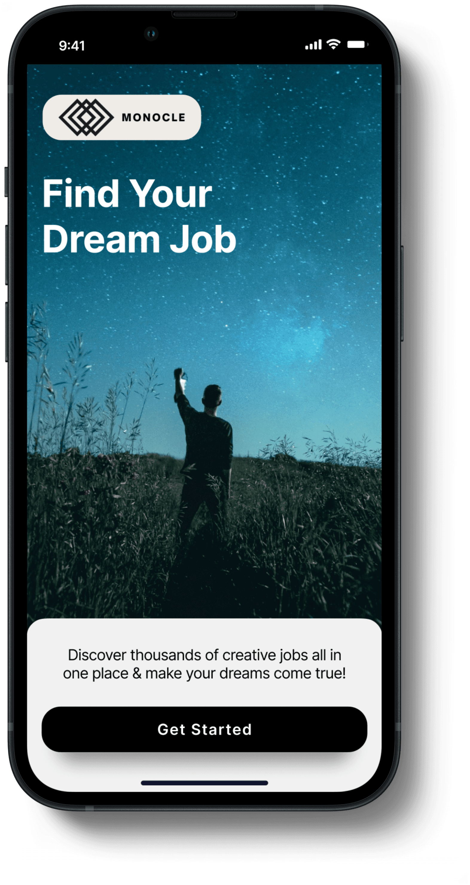
Monocle
UIX/UI Design Project
Spring 2024
Monocle
UIX/UI Design Project
Spring 2024
I Enhanced The Process Of Job Hunting With
An App That Puts Usability First
Project
Overview
Project Timeline:
Spring 2024
Tools Used:
Figma
Roles:
UX Researcher, UX & UI Designer
Monocle is a modern job search app with a focus on the creative and tech industries. It aims to enhance the user experience by improving features and making job searching easier.
Solution
The Monocle Job search app aims to enhance usability by improving pre-existing features & adding new ones to help users get the results they are after.
Problem
Job hunting can be frustrating. The lack of responses from employers, filters that do not give you precise results and lengthy application processes all add up.
Project Overview
Impact &
Value Added
Project Overview
Impact &
Value Added
Inclusive & Accessible
More accessible and inclusive. For example filters that identify a job is accessibly friendly.
Improved Filters
Refined filters to give users better options to help them find exactly what they are looking for.
Guaranteed Responses
You will be updated on the progress of your application and are guarnateed a response.
Bridge Skill Gaps
Get connected to courses and bridge skill gaps mentioned in job descriptions.
Transparent Approach
Salary information is shown upfront so you know what to expect straight away.
Better User Experience
Clean and simple to navigate interface enhancing the users experience
Research & Planning
Competitor Analysis
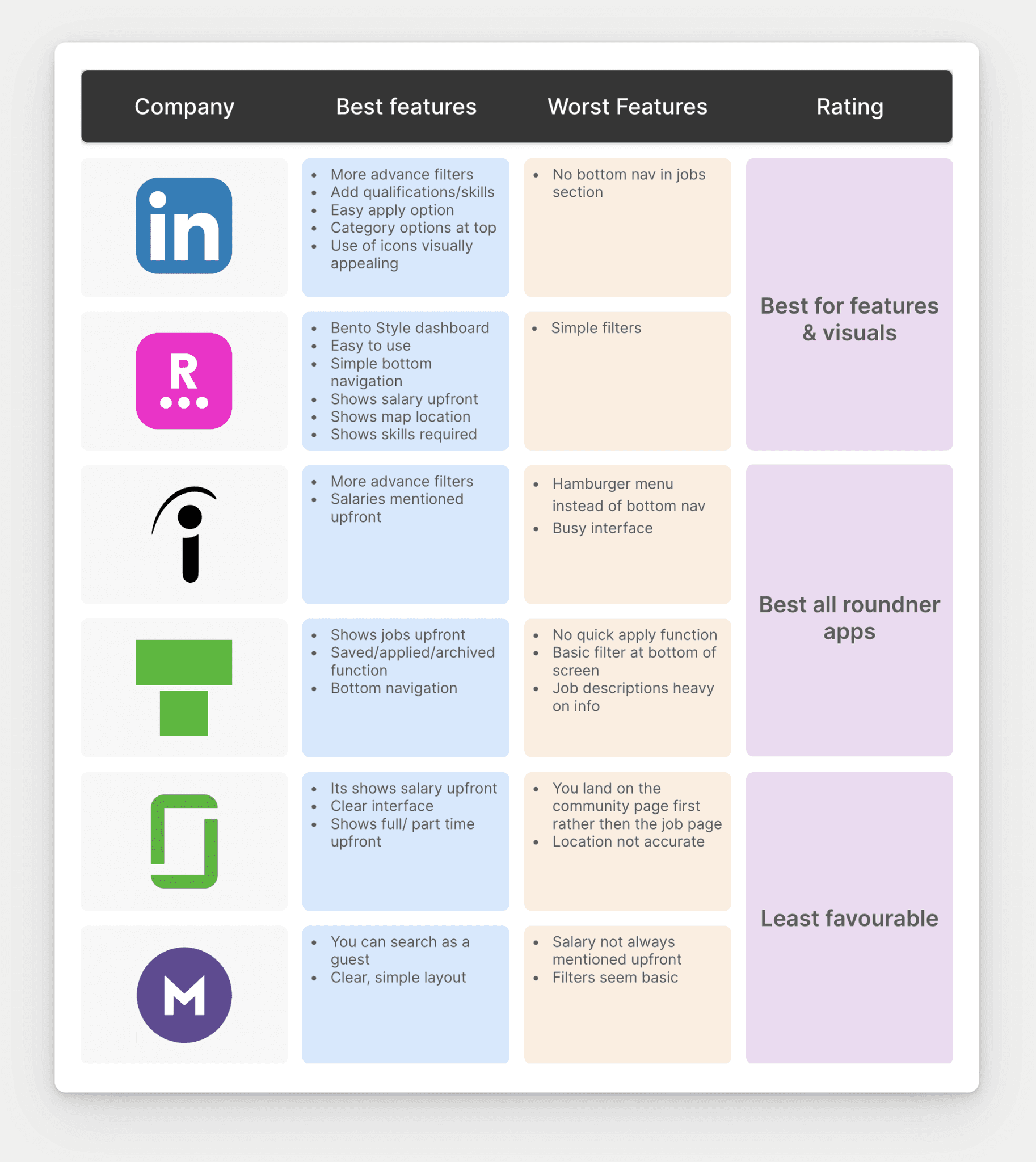
Key Takeaways From Competitor Analysis
Out of the 6 apps a minimum of at least 3 only had basic filters
A few showed salaries up front but not on all job ads
While each apps UI was mostly easy to use not everyone had a bottom navigation affecting reachability
Research & Planning
User Research
Quantitative & Qualitative User Research
Initial research
I surveyed users to identify their job app pain points, preferred features and opportunities. Additionally, I conducted interviews to delve deeper into their application experiences.


Survey Results Based On 25 Users Responses
Users frustrated with repetitive data input during job search
Entry-level cover letters deemed pointless; more beneficial for experienced roles
Overwhelming email suggestions and irrelevant jobs created negative experience
Inaccurate location settings and filters, especially for remote work seekers
Situational tests prolonged process, making it feel long-winded
Indeed popular for job hunting
Lack of response and undisclosed salaries major painpoint
Sometimes users feel recruiters are trying to fill roles that do not match their needs
Results Based On User Interviews
Research & Planning
User Stories
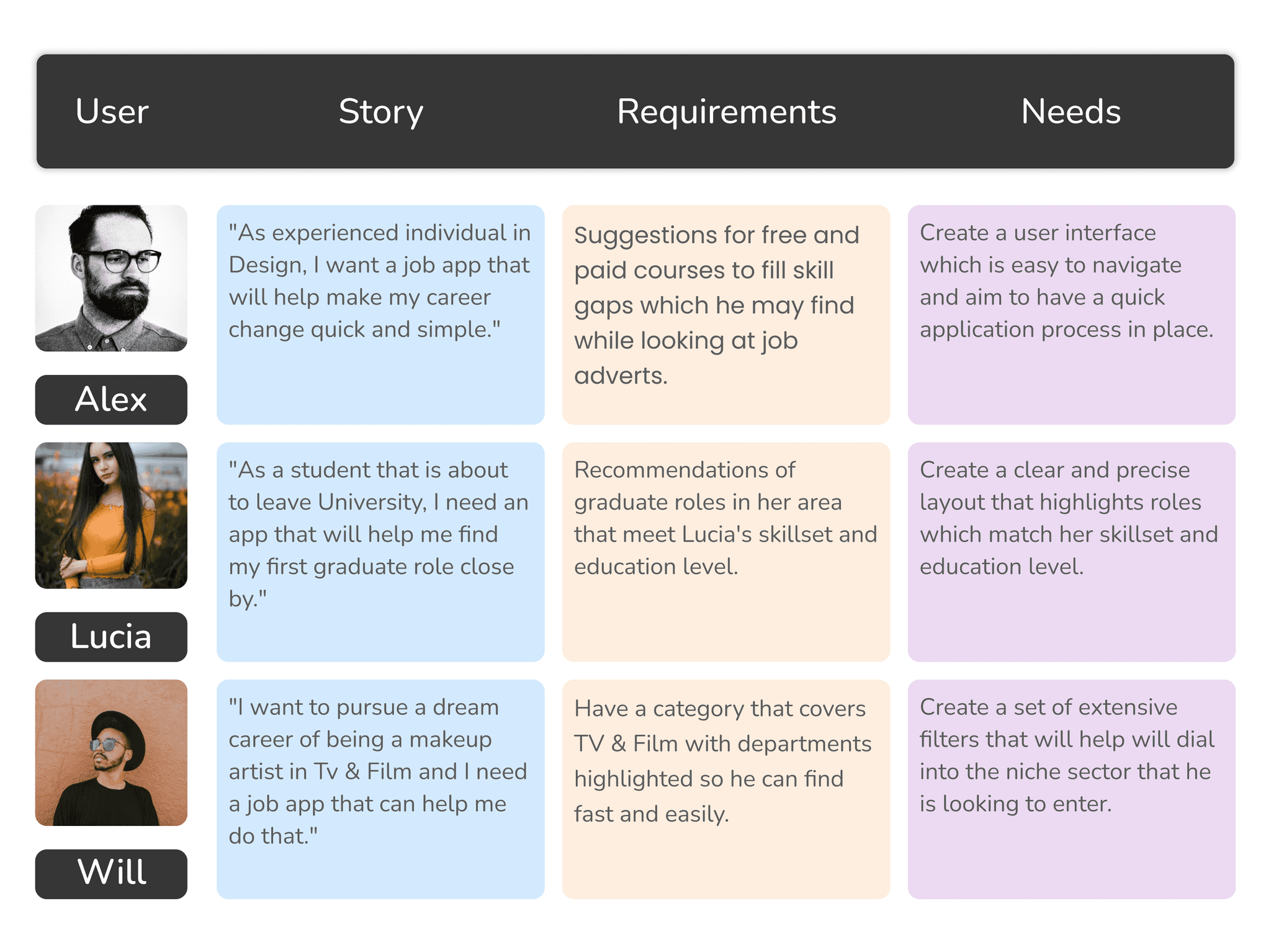
User Stories - Alex, Lucia & Will
Here are user stories tailored to each of our personas. Each story delves into the persona's lifestyle, outlines their needs from the try-on app, and identifies the necessary implementations to fulfill their requirements.
Research & Planning
Experience
Map

The experience map below identifies the actions Alex takes when he uses the app as well as what he is thinking and feeling at different stages of the process. Opportunities are also presented identifying areas for improvement
Research & Planning
Task & User
Flow
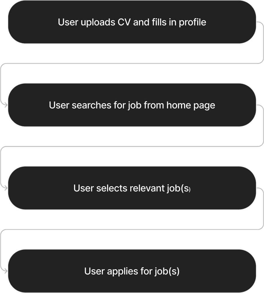
Task and User Flow
I outlined the fundamental stages a user follows when applying for a job. This helped me maintain concentration on the current task and also shaped the integration of additional features like filters.

Branding & UI
Branding & UI

Text Sizing
I wanted to use a text styling that that felt consistent and so I used multiples of 8 with body text sitting at 16px and the largest - H1 at 40px
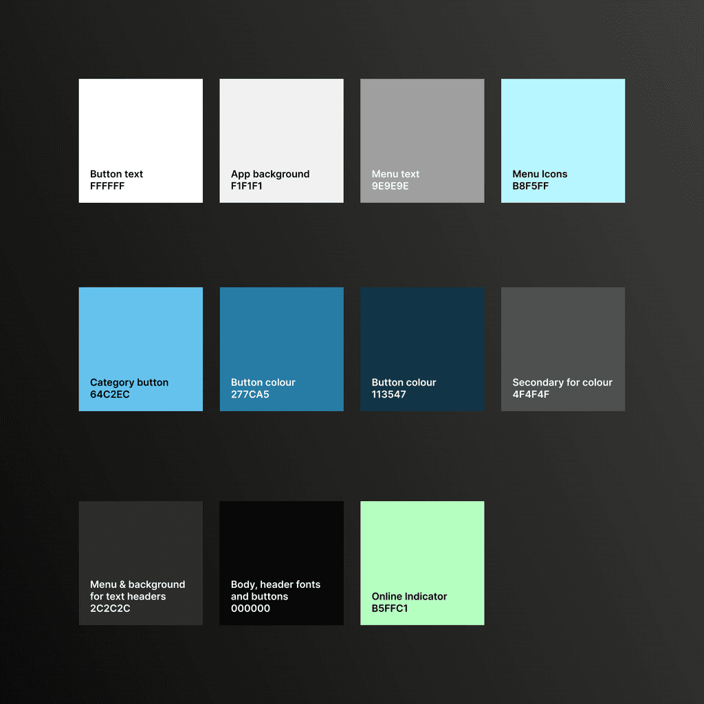
Colours
After examining other job apps, I noticed many shared similar color schemes that lacked appeal. To stand out, I opted for a bold and eye-catching palette to enhance user attraction.

Logo Design
I wanted to create a simple yet elegant logo that would represent the brand and this is the result I came up with.
Wireframes & Prototyping
Hi Fidelity Wireframes
High fidelity versions of the apps pages with the chosen colour scheme, typeface and final layouts.
Low Fidelity
Wireframes
I translated sketches into low-fidelity wireframes in Figma, refining designs and gathering feedback to enhance usability.
I developed app page layouts, integrating user-tested features
and exploring multiple versions to optimize user-friendliness.
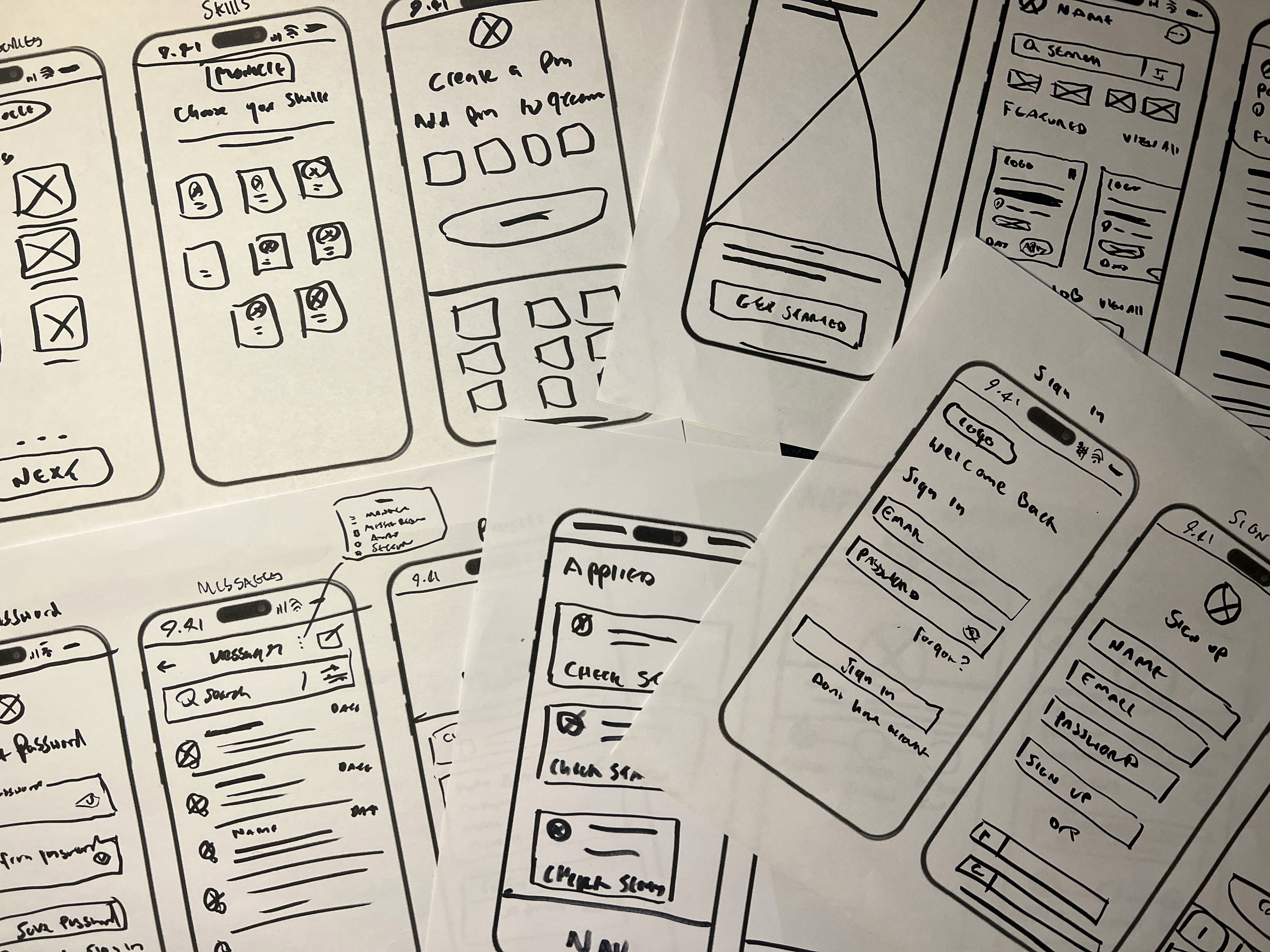
Paper Sketches
Final Designs
End Product
Connect with recruiters and employers instantly
Open up your profile card from the home screen and show recruiters and professionals your QR code. They can scan this and instantly be linked to your LinkedIn where they can connect with you!
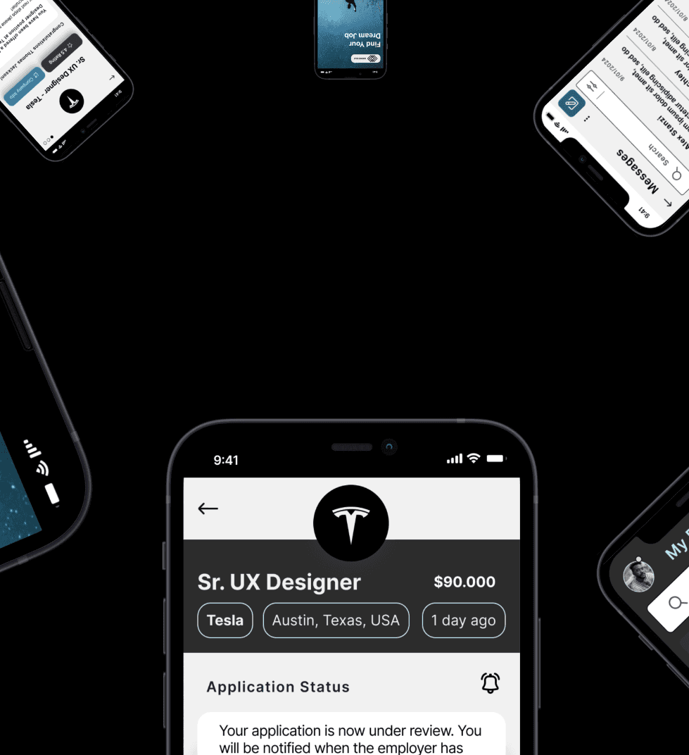
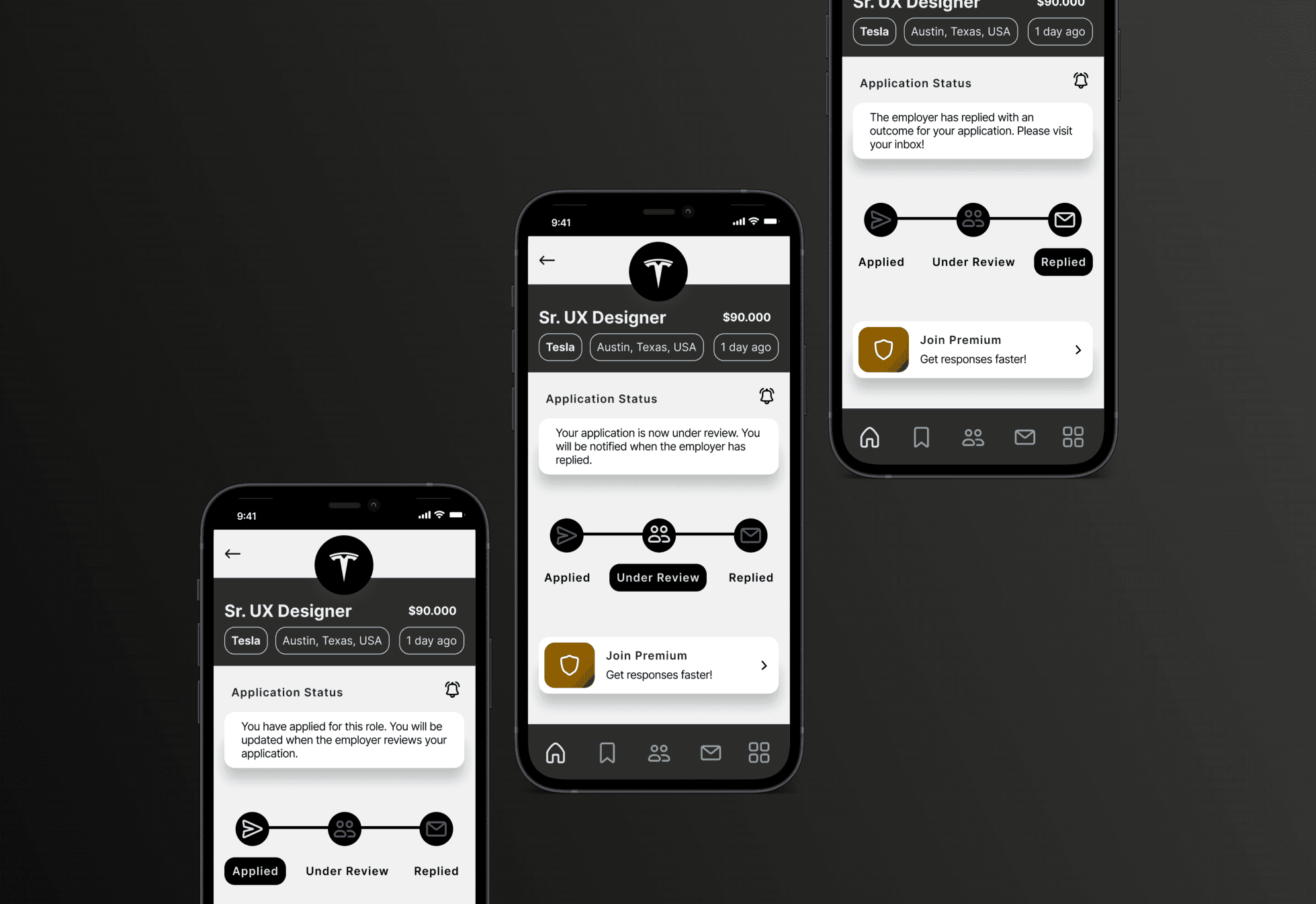
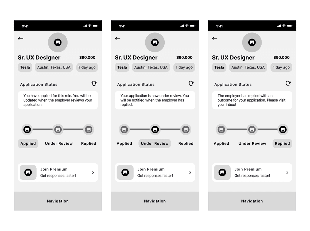
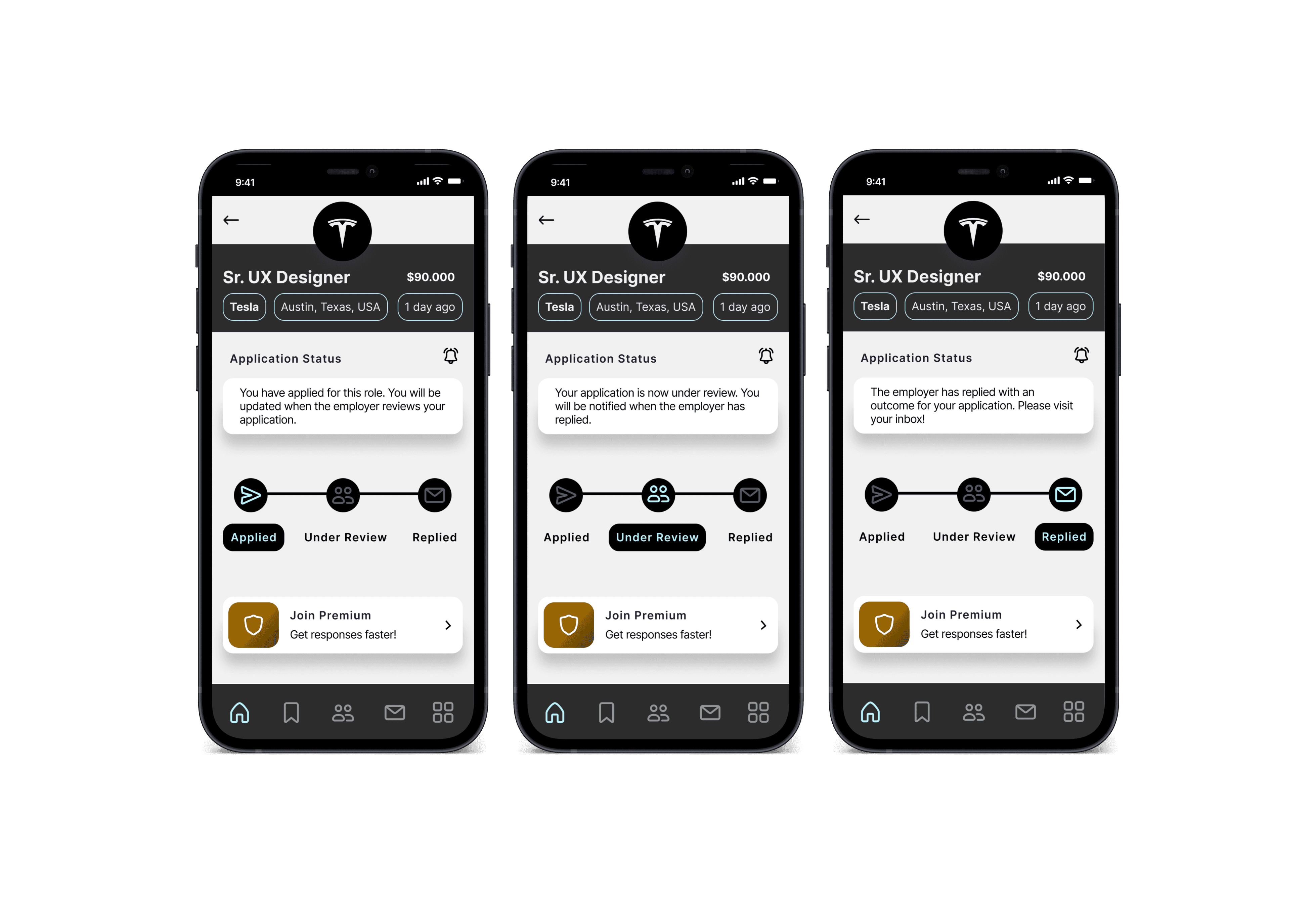
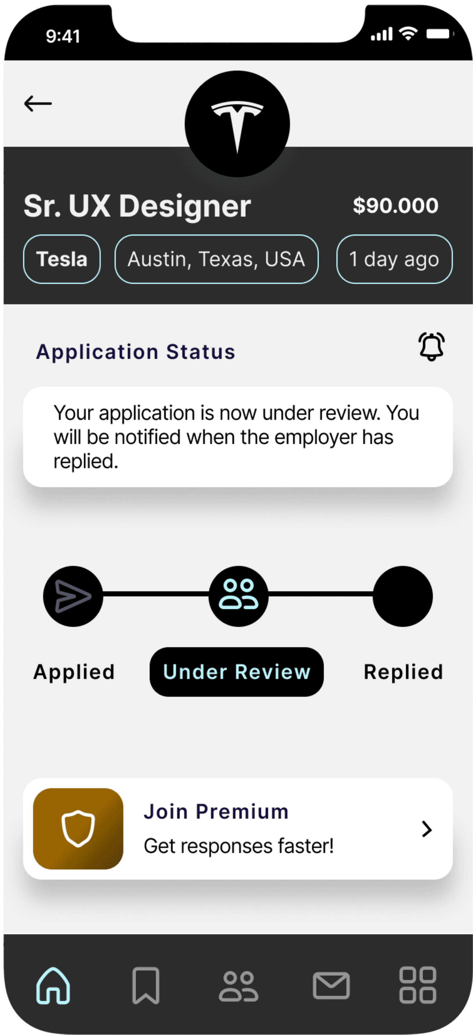
Get notified on you application status
Keep track of the status of your application and receive a guaranteed response from the employer. Hit the bell in the corner for status notifications!
Reduce time searching with better filters
Advance filters now give you more tailored options reducing time spent on searching. Location accurate and filters highlighting accessible roles are some of the key features.
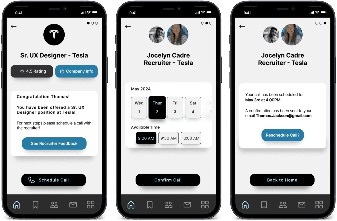
Rather then miss a call from an employer that is offering you a job, you can now schedule a call with them so you do not miss out.
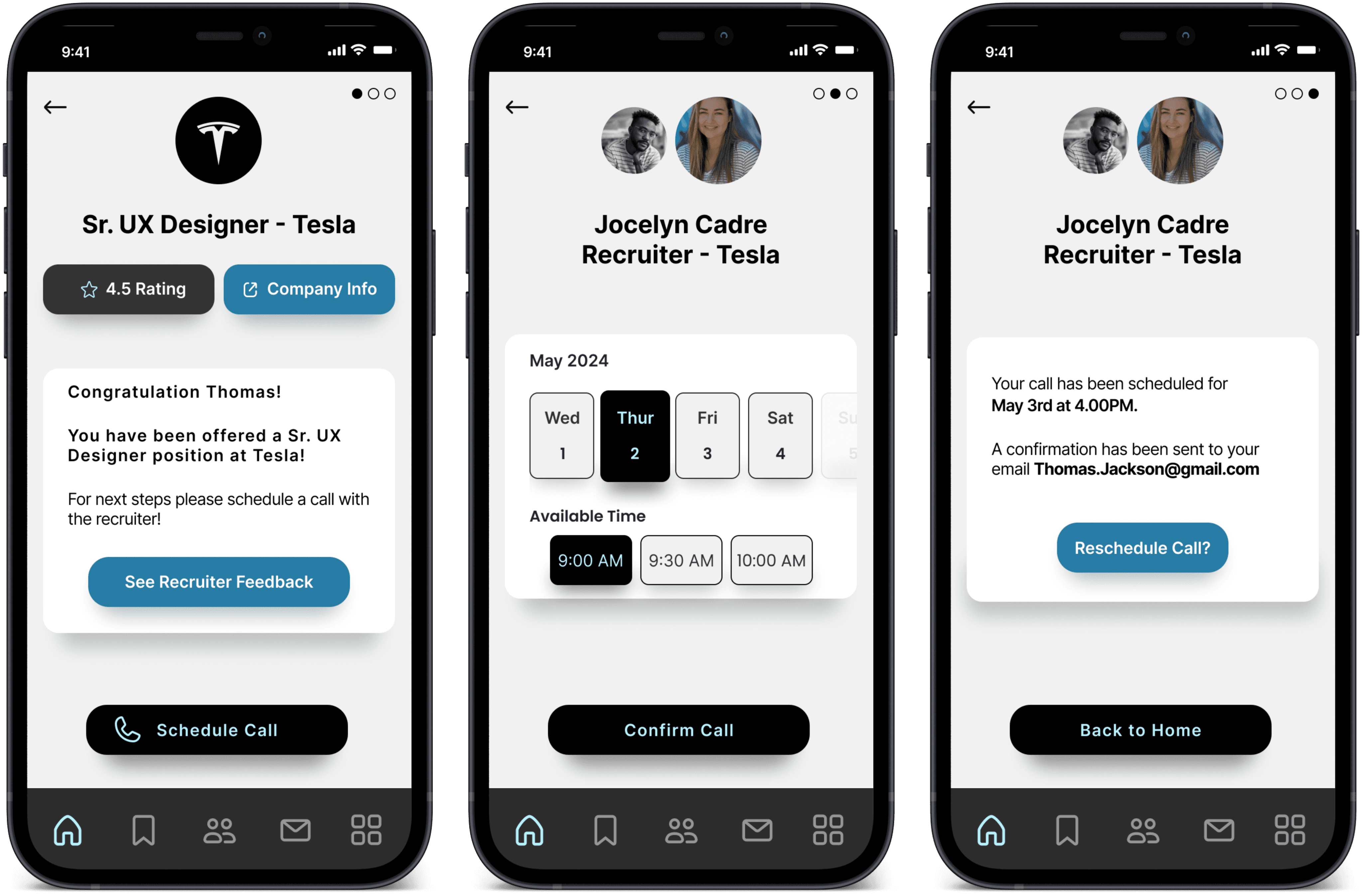
Schedule a call with an employer
Other Projects


The Design Process
The Design Process
The Design Process
Monocle is a modern job search app with a focus on the creative and tech industries. It aims to enhance the user experience by improving features and making job searching easier.
Project Timeline: Spring 2024
Tools Used: Figma, Survey Monkey
Roles: UX Researcher, UX & UI Designer
Problem
Job hunting can be frustrating. The lack of responses from employers, filters that do not give you precise results and lengthy application processes all add up.
Solution
The Monocle Job search app aims to enhance usability by improving pre-existing features & adding new ones to help users get the results they are after.
I Enhanced The Process Of Job Hunting With
An App That Puts Usability First
I Enhanced The Process Of Job Hunting With
An App That Puts Usability First
Monocle is a modern job search app with a focus on the creative and tech industries. It aims to enhance the user experience by improving features and making job searching easier.
Project Timeline: Spring 2024
Tools Used: Figma, Survey Monkey
Roles: UX Researcher, UX & UI Designer
Problem
Job hunting can be frustrating. The lack of responses from employers, filters that do not give you precise results and lengthy application processes all add up.
Solution
The Monocle Job search app aims to enhance usability by improving pre-existing features & adding new ones to help users get the results they are after.
I Enhanced The Process Of Job Hunting With An App That Puts Usability First
UIX/UI Design Project Spring 2024
Monocle


Project Overview
Project Overview
Impact &
Value Added
Inclusive & Accessible
More accessible and inclusive. For example filters that identify a job is accessibly friendly.
Improved Filters
Refined filters to give users better options to help them find exactly what they are looking for
Guaranteed Responses
You will be updated on the progress of your application and are guarnateed a response
Bridge Skill Gaps
Get connected to courses and bridge skill gaps mentioned in job descriptions.
Transparent Approach
Salary information is shown upfront so you know what to expect straight away.
Better User Experience
Clean and simple to navigate interface enhancing the users experience
Research & Planning
Competitor Analysis
Key Takeaways From Competitor Analysis
Out of the 6 apps a minimum of at least 3 only had basic filters
A few showed salaries up front but not on all job ads
While each apps UI was mostly easy to use not everyone had a bottom navigation affecting reachability
Bento Style dashboard
Easy to use
Simple bottom navigation
Shows salary upfront
Shows map location
Shows skills required
Simple filters
Best all roundner
apps
Its shows salary upfront
Clear interface
Shows full/ part time upfront
You land on the community page first rather then the job page
Location not accurate
You can search as a guest
Clear, simple layout
Salary not always mentioned upfront
Filters seem basic
Least favourable
Company
Worst Features
Rating
Best features

More advance filters
Add qualifications/skills
Easy apply option
Category options at top
Use of icons visually appealing
No bottom nav in jobs section
Best for features & visuals
Shows jobs upfront
Saved/applied/archived function
Bottom navigation
No quick apply function
Basic filter at bottom of screen
Job descriptions heavy on info
More advance filters
Salaries mentioned upfront
Hamburger menu instead of bottom nav
Busy interface
Key Takeaways From Competitor Analysis
Out of the 6 apps a minimum of at least 3 only had basic filters
A few showed salaries up front but not on all job ads
While each apps UI was mostly easy to use not everyone had a bottom navigation affecting reachability
Research & Planning
User Research
Quantitative & Qualitative User Research
Initial research
I surveyed users to identify their job app pain points, preferred features and opportunities. Additionally, I conducted interviews to delve deeper into their application experiences.
Survey Results Based On 25 Users Responses
Quantitative & Qualitative User Research
Initial research
I surveyed users to identify their job app pain points, preferred features and opportunities. Additionally, I conducted interviews to delve deeper into their application experiences.
Research & Planning
User Stories
Survey Results Based On 25 Users Responses
Quantitative & Qualitative User Research
Initial research
I surveyed users to identify their job app pain points, preferred features and opportunities. Additionally, I conducted interviews to delve deeper into their application experiences.
Survey Results Based On 25 Users Responses
User Stories - Alex, Lucia & Will
User Stories - Alex, Lucia & Will
User Stories - Alex, Lucia & Will
Here are user stories tailored to each of our personas. Each story delves into the persona's lifestyle, outlines their needs from the try-on app, and identifies the necessary implementations to fulfill their requirements.
User Stories - Alex, Lucia & Will
Here are user stories tailored to each of our personas. Each story delves into the persona's lifestyle, outlines their needs from the try-on app, and identifies the necessary implementations to fulfill their requirements.
Research & Planning
Experience Map
The experience map below identifies the actions Alex takes when he uses the app as well as what he is thinking and feeling at different stages of the process. Opportunities are also presented identifying areas for improvement
Experience Map - Alex
Experience Map - Alex
The experience map below identifies the actions Alex takes when he uses the app as well as what he is thinking and feeling at different stages of the process. Opportunities are also presented identifying areas for improvement
The experience map below identifies the actions Alex takes when he uses the app as well as what he is thinking and feeling at different stages of the process. Opportunities are also presented identifying areas for improvement
Experience Map - Alex
Research & Planning
Task & User Flow

I outlined the fundamental stages a user follows when applying for a job. This helped me maintain concentration on the current task and also shaped the integration of additional features like filters.
Task and User Flow
Branding & UI
Branding & UI

Colours
After examining other job apps, I noticed many shared similar color schemes that lacked appeal. To stand out, I opted for a bold and eye-catching palette to enhance user attraction.
Text Sizing
I wanted to use a text styling that that felt consistent and so I used multiples of 8 with body text sitting at 16px and the largest - H1 at 40px
Logo Design
I wanted to create a simple yet elegant logo that would represent the brand and this is the result I came up with.
Wireframes & Prototyping
Paper Sketches
I developed app page layouts, integrating user-tested features
and exploring multiple versions to optimize user-friendliness.
Low Fidelity Wireframes
I translated sketches into low-fidelity wireframes in Figma, refining designs and gathering feedback to enhance usability.
Hi Fidelity Wireframes
High fidelity versions of the apps pages with the chosen colour scheme, typeface and final layouts.
Hi Fidelity Wireframes
High fidelity versions of the apps pages with the chosen colour scheme, typeface and final layouts.
Low Fidelity Wireframes
I translated sketches into low-fidelity wireframes in Figma, refining designs and gathering feedback to enhance usability.
Paper Sketches
I developed app page layouts, integrating user-tested features
and exploring multiple versions to optimize user-friendliness.
End Product
Final Designs
Connect with recruiters and employers instantly
Open up your profile card from the home screen and show recruiters and professionals your QR code. They can scan this and instantly be linked to your LinkedIn where they can connect with you!
Open up your profile card from the home screen and show recruiters and professionals your QR code. They can scan this and instantly be linked to your LinkedIn where they can connect with you!
End Product
Final Designs
End Product
Final Designs
Reduce time searching with better filters
Advance filters now give you more tailored options reducing time spent on searching. Location accurate and filters highlighting accessible roles are some of the key features.
Reduce time searching with better filters
Advance filters now give you more tailored options reducing time spent on searching. Location accurate and filters highlighting accessible roles are some of the key features.
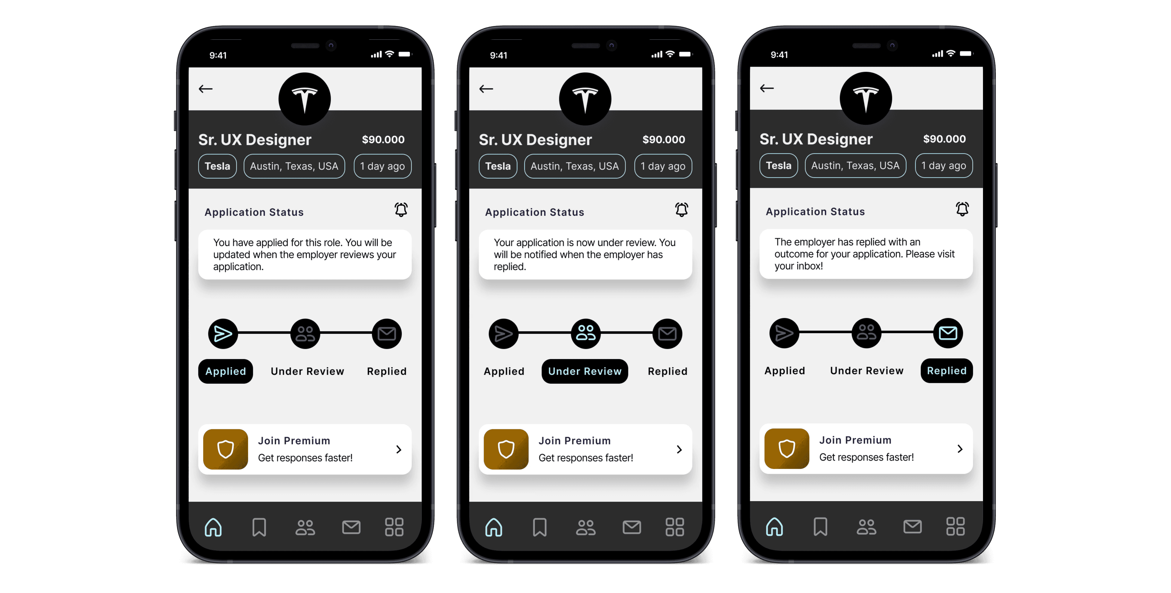
Get notified on you application status
Keep track of the status of your application and receive a guaranteed response from the employer. Hit the bell in the corner for status notifications!
Keep track of the status of your application and receive a guaranteed response from the employer. Hit the bell in the corner for status notifications!
Get notified on you application status
Keep track of the status of your application and receive a guaranteed response from the employer. Hit the bell in the corner for status notifications!
Get notified on you application status
Schedule a call with an employer
Rather then miss a call from an employer that is offering you a job, you can now schedule a call with them so you do not miss out.
Schedule a call with an employer
Rather then miss a call from an employer that is offering you a job, you can now schedule a call with them so you do not miss out.
Other Projects
© Robert Beeton 2024

© Robert Beeton 2024
© Robert Beeton 2024